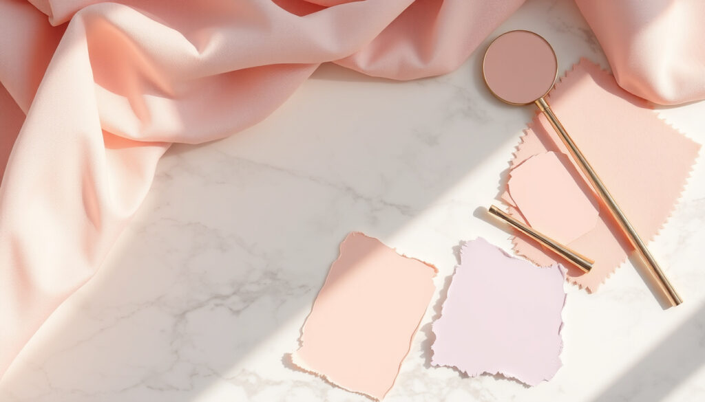
Light Spring Color Palette: Colors, Metals & Celebrities
While many spring subtypes exist, light spring stands out as the warmest and lightest, forming a bridge between warm and neutral. Understanding whether you belong to this season can transform how you shop, dress, and choose jewelry.
Temperature: Warm ·
Value: Light ·
Chroma: Clear ·
Season Family: Spring ·
Suggested Metal: Gold ·
Celebrity Example: Saoirse Ronan
Quick snapshot
- Light spring has warm undertones (Gabrielle Arruda (seasonal color analyst))
- Gold is typically recommended over silver (Four Seasons Studio (color analysis resource))
- Saoirse Ronan is a widely cited light spring example (Four Seasons Studio (color analysis resource))
- Exact rarity percentage of light spring in the population (no consensus across sources)
- Precise number of colors in the palette varies by analyst method
- Seasonal color analysis has gained mainstream traction since 2021, but light spring remains one of the less-documented subtypes
- Growing demand for science-backed color analysis and expanded celebrity case studies
The following table summarizes the key attributes of the light spring palette.
| Attribute | Value |
|---|---|
| Season Group | Spring |
| Subtype | Light |
| Temperature | Warm |
| Value | Light |
| Chroma | Clear |
| Suggested Metal | Gold |
What colors look best on light spring?
Warm pastels and soft neutrals
The light spring color palette reads like a garden at first bloom.
The hues of new beginnings include peach blossom, lemon chiffon, soft seafoam, rosy shell, and meadow green.
— Gabrielle Arruda, seasonal color analyst. These are not the dusty, muted pastels of summer seasons—they have warmth and clarity baked in.
Neutral shades follow the same principle: soft champagne, rose gold, taupe, cream, pale gold, and peachy pink. Four Seasons Studio (color analysis resource) confirms that light spring core neutrals include creamy white, peach, light coral, warm pink, soft gold, soft blues, light aqua, warm greens, light beige, and warm taupe. These aren’t the stark whites or cool grays that dominate other palettes.
Clear corals and seafoam greens
Light spring individuals have a delicate, gentle contrast between hair, eyes, and skin, which means they carry clear, warm tones beautifully. The palette’s chroma is clear without being sharp—colors look clean and fresh, not muddy or washed out. As Soul Of Color (color analysis blog) notes, light spring key colors include warm peach, sunshine yellow, light coral, and spring green—each with a soft but lively energy.
Light spring’s soft warmth works beautifully in daylight but can disappear against overly saturated backgrounds. For anyone building a capsule wardrobe, the winning move is to pair one clear statement piece (say, a light coral blazer) with the warm neutrals that ground it.
Avoiding harsh darks
Darker tones overwhelm the delicate features characteristic of a light spring. Four Seasons Studio (color analysis resource) warns that the palette should avoid black, navy, charcoal, and pure white. The same logic applies to icy tones: icy blue, silver, and cool grays drain the warmth from a light spring’s complexion. Dusty, grayed-out pastels—the kind typically found in soft summer palettes—also fall flat because they sap the clear warmth that makes a light spring glow.
Does light spring look better in gold or silver?
Gold as the primary recommendation
The short answer is gold, and the reasoning is rooted in undertone chemistry. Light spring has warm undertones, which harmonize with gold’s yellow-based warmth. Gabrielle Arruda (seasonal color analyst) categorizes the light spring undertone as neutral-warm—warm enough to glow in gold, but not so saturated that silver becomes completely unwearable.
Rose gold as an alternative
Rose gold sits in a sweet spot for light springs who find standard gold too brassy. It offers warmth with a softer, pinker undertone that mirrors the peachy and coral notes in the palette. As Gabrielle Arruda (seasonal color analyst) puts it, recommended textures for light spring include sheen materials like pearl, cream, and soft gold—matte-sheen blends that catch light without glare. Rose gold fits that exact description.
Shoppers who default to silver because “it goes with everything” might be dulling their light spring glow. The actual cost of the wrong metal: a face that looks washed out rather than illuminated, especially in natural daylight.
Why silver is less flattering
Silver is cool-toned and can wash out light spring skin, which relies on warmth to stay vibrant. The contrast between a warm complexion and cool metal creates a disharmony that registers as flatness. Copper, on the other hand, works well because it shares gold’s warm base with a slightly rustic, earthy finish.
The trade-off: light springs can occasionally wear silver if it’s textured or mixed with warm elements, but the default metal drawer should be gold or rose gold.
Am I light or true spring?
Key differences in color depth
Light spring and true spring share warmth and brightness, but they diverge on one axis: intensity.
Both are warm, light, and bright, but light spring is airier and more delicate, while true spring is punchier and more saturated.
— Soul Of Color. This isn’t subtle—it’s the difference between a watercolor wash and a full acrylic pour.
The following comparison table highlights the differences between light spring and true spring.
| Attribute | Light Spring | True Spring |
|---|---|---|
| Temperature | Warm, neutral-warm | Pure warm |
| Value | Light (highest of all seasons) | Light to medium |
| Chroma | Clear, medium brightness | Bright, highly saturated |
| Color examples (warm) | Peach, light coral, soft gold | Orange-red, vivid yellow, grass green |
Light spring has softer, lighter colors
Gabrielle Arruda (seasonal color analyst) explains that light spring has the highest overall value of any season, with many tints (white added) throughout the palette. The chroma is medium, leaning slightly bright—clean without sharpness. True spring, by contrast, has a more saturated chroma and a purer warm undertone with less neutral influence.
True spring has brighter, more intense hues
Where true spring can carry a bold orange-red, light spring looks best in a light-to-medium pinky coral. True spring can wear vivid warm yellows; light spring needs a softer, more golden version. The same principle applies to eye color: Gabrielle Arruda (seasonal color analyst) notes that light spring eyes are typically light blue, green, hazel, or light brown with warm undertones, whereas true spring eyes are brighter, more striking versions of those same colors.
The pattern: if you can borrow colors from both soft summer and true spring without looking off, you’re probably a light spring.
What is Saoirse Ronan’s color season?
Saoirse Ronan as a light spring example
Few celebrities illustrate a seasonal type as clearly as Saoirse Ronan illustrates light spring. Four Seasons Studio (color analysis resource) classifies her as a light spring based on her delicate features, warm undertones, fair skin, light blue eyes, and soft blonde hair. Her coloring has that signature light spring quality: gentle contrast rather than stark difference between features.
Her characteristic warm, light coloring
Ronan’s best public appearances tend to feature soft pastels and warm neutrals—colors that honor her natural lightness without overpowering it. She has light hair, fair skin with warm undertones, and light eyes, exactly the triad that defines the light spring season. According to Gabrielle Arruda (seasonal color analyst), the light spring palette pulls warmth from spring and softness from summer, resulting in a warm-neutral hue with a subtle cool influence—Ronan’s coloring fits this description.
How her palette influences styling
For real-world application, Ronan’s case suggests that light springs should seek color swaps rather than wholesale changes. Instead of a bold red, try clear coral. Instead of mustard, try chamomile. Instead of deep rust, try peach. These are not compromises; they are upgrades tailored to the light spring’s specific color signature.
What this means: Saoirse Ronan’s styling success isn’t arbitrary—it’s a case study in what happens when a person’s wardrobe respects their seasonal boundaries.
What colors should a light spring avoid?
Harsh, dark colors
The light spring palette is defined by its lightness, so colors at the dark end of the spectrum create the most obvious mismatch. Black, navy, charcoal, and pure white all violate the light spring’s core value requirement. Four Seasons Studio (color analysis resource) specifically advises against these shades, which can overwhelm the delicate contrast between a light spring’s features.
Cool icy tones
Icy blue, silver, and cool grays sit on the opposite side of the temperature spectrum from light spring’s warm base. Wearing these colors creates a visual disconnect—the warm skin undertone fights the cool garment tone, and neither wins. The result is a washed-out appearance that no amount of makeup can fully correct.
Overly muted or dusty shades
Dusty rose, grayed lavender, and muted sage belong to the soft summer palette, not light spring. Because light spring’s chroma is clear rather than muted, any color that looks “dusty” or “grayed” will appear dull against a light spring’s skin. The palette needs the freshness of spring, not the haze of late summer.
The catch: the difference between a flattering light spring color and an unflattering one often comes down to a single variable—temperature or chroma. A color that is warm but too dark (like chocolate brown) fails on value. A color that is light but cool (like icy pink) fails on temperature. Getting both right is the goal.
For light springs, the rule is simple: prioritize warmth and lightness in every color choice.
Related reading: White Dresses for Women: Irish Shopping & Styling Guide · Eyelash Extensions Near Me: Prices, Salons & Care Tips
Frequently asked questions
What is the difference between light spring and soft summer?
Light spring is warm and clear; soft summer is cool and muted. Light spring colors have a warm undertone with visible brightness, while soft summer colors are grayed and dusty. The easiest test: if peach makes you glow, you’re spring; if dusty rose makes you glow, you’re summer.
Can light springs wear black?
Generally, black is too harsh for light spring’s delicate contrast. If black is unavoidable, wear it away from the face—a black skirt or pants with a warm pastel top. A better alternative: dark chocolate brown or charcoal gray, which offer depth without the starkness of black.
What lipstick colors suit light spring?
Warm, sheer, and light. Think peach gloss, coral balm, or soft rose tint. Avoid dark berry, brick red, or any lipstick with a blue or cool base. The goal is to enhance the natural lip color, not overpower it.
How do I know if I am a light spring or light summer?
The primary difference is undertone. Light spring is warm (gold veins, yellow-skin sheen, peachy flush). Light summer is cool (blue veins, pinkish flush, silver compliments). The light spring palette includes peach and coral; light summer includes rose and lavender.
What nail colors for light spring?
Soft peach, ballet pink, coral, pale gold, seafoam green, and sheer nude with warm undertones. Avoid dark reds, blue-based pinks, and cool whites. Sheer and glossy finishes complement the light spring aesthetic better than matte.
Is light spring the same as light summer?
No. They share the “light” value but differ in temperature and chroma. Light spring is warm and clear; light summer is cool and slightly muted. The two palettes share almost no colors—a light spring cannot swap into light summer clothing without looking washed out.
What hair color works for light spring?
Warm blonde (honey, strawberry, golden), light brown with warm highlights, and copper tones all work. Avoid ashy blonde, cool brown, and black. The hair color should have visible warmth and not be significantly darker than the skin’s contrast level.
Can light springs wear white?
Pure white (stark, cool, bright) is not recommended. Creamy white, eggshell, or ivory work beautifully because they carry warm undertones. The difference is visible in natural light: pure white reflects blue, creamy white reflects gold. For more on styling white garments, see our white dresses guide.
More related posts
 Is Gatorade Good for You? Benefits, Risks Explained
 Toyota RAV4 Hybrid Ireland: Cost, Reliability & Best Years
 Mission Impossible Dead Reckoning Part 2: 2025 Release & Flop
 Wisconsin Supreme Court Race Polls 2026: Results & Analysis
 Where Is Area 51? Location, History & Access
 Is Conan Gray Gay? His Unlabelled Identity Explained
 How Much Is Apple TV? Pricing Guide & Costs (€9.99)
 T-Mobile Store Near Me: Locator, Hours, Corporate Locations
